Yesterday, Smashing Magazine had a fun post on using the 7 Deadly Sins to help promote your website. I love posts like this because of the context they provide when thinking about concepts of promotions and marketing. By itself, the post is a good read, but some of the examples don’t precisely translate to our world, so I thought I would go through them with some higher ed context. You are welcome to agree or disagree with my examples, and I encourage everyone to share their own ideas or examples in the comments or on Twitter with the tag #7sinmktg.
To quote Smashing Magazine regarding the application of the 7 Deadly Sins to web marketing:
Since the beginning of time, people have exploited the human desire to sin so that they could achieve their goals. Finding out what causes people to sin helps us understand the triggers which prompt people to take an action. The Web has made it even easier to exploit these tendencies to sin, in order to build user engagement and excitement about your service or product.
Sin #1: Pride
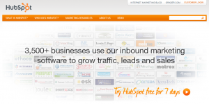
Pride is probably the easiest one to understand and use, especially in higher education. Who among us hasn’t sat through a meeting or strategy session where the topic was to figure out ways to show off how proud the faculty, students, and alumni are of our university? If you haven’t, just give it time. It will happen. But more to the point, how does that feed into a web strategy? Our homepages are dominated by centerpieces, news feeds, event listings, and quicklinks. Are you showing your pride? Smashing Magazine points out that SEOMoz is. In fact, this is a common practice of service providers online.
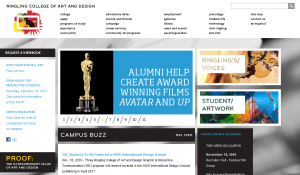
How can we do more with it? In the same fashion, imagine a section of the home page devoted to showing off the achievements and awards your students are getting. Highlight the fancy, important companies that graduates are getting jobs at. Promote what makes you special. It really is as easy as it sounds, and when you get down to it, this is some real base level stuff. When you browse university home pages and really pay attention to how little they are promoting the pride they have in their school, it’s a little surprising.
I should also point out that in many cases, we do show off our pride, the problem is in part where it is done at. Buried under campus life pages or on alumni sites. This is prime recruitment territory, consider the impact it can have on prospective students.
Sin #2: Gluttony
When dealing with gluttony, different schools will likely have different ways of approaching its usage. For example, at our school full time students pay a flat rate regardless of hours. So, a student taking 12 hours would pay the same as one taking 20. IT’S A CREDIT HOUR BUFFET! ARE WE CRAZY? MAYBE! DON”T MISS OUR SALE ON WACKY WILD INFLATABLE TUBE GUYS! This is a fantastic selling point, especially as our full time rate is one of the lowest in both the state and region. Kids can come here and save a ton of money by taking advantage of credit hour overindulgence.
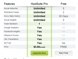
Think about things that come with being a student: tickets to games, access to facilities, free slushy machines and pool tables in dorms. You might even consider more mundane services like Books24x7 (or similar services that allow online access to full books) that places like your library might offer. These are your “product features.” Even though it might be included in the cost of tuition, you can still market it as a perk of being there. So why aren’t you?
Sin #3: Sloth
People are lazy. People on the web are lazier. It’s a fact of life I assume we’re all aware of. Sloth is such an easy instinct to tap in to, especially on the web. How many questions and pages make up your online application. Think about that. Of course, the first reaction I’d expect from many of you would be that “We can’t simplify the application process because there’s too much that’s required.” Bull. Sure, you can’t simplify the application, but there is a ton that you can do for the process. Imagine a world where a prospective student could begin the application process (or really, engage with admissions at a much earlier point in the funnel) with the click of a single button. No form. No fields to enter. It’s possible, right now. That’s the magic of Facebook Connect. Students know they’ll have to do a lot of paperwork to apply, but why chase them off by throwing it all at them to begin with?
The same goes for your student portal system. Canned solution or home grown, as our portals get more powerful, they are also getting more complex. How many people on your staff are dedicated to improving and simplifying the actual user experience of your portal? How hard is it to drop a class? Do a degree audit? This comes back to a point I made in the previous section, about selling the experience of your school like a product. This is another “product feature” that you could showcase. This is hard, because it requires your developers to really think like real world product developers, and it requires you to QA your systems in a way that isn’t familiar to higher ed. But, if we just keep making our tools more powerful and more complex, they’ll just keep getting harder to use. That doesn’t appeal to Sloth.
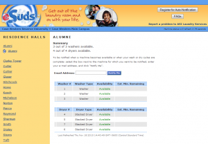
Getting back to the student experience, think again about secondary services designed to make their lives easier: bus GPS tracking, laundry machine monitoring, local business discounts, and other services. This is also a place that a great mobile site will serve you well. If a student can get what they need just by pulling out their phone and not moving an inch from the chair, that’s a win. That’s a marketable quality.
Sin #4: Envy
You have it, I don’t. Cornerstone emotion involved with envy. This is one that will play especially well with the alumni crowd, because there’s so much opportunity for it. Are you actively creating and promoting events that give special perks to alumni of your school? This works especially well if it’s a public event. Perhaps alumni and students get prime choice seating for a special speaker. Give them access to a special food tent at sporting events. Send them discounts to your store. Alumni are special people, treat them that way. Of course, that’s kind of a stupid comment. The real point is to show off the fact that they get special treatment. Envy doesn’t work if other people don’t realize what they are missing out on.
Give these special people the opportunity to help plan special events. Involve them at a higher level in opportunities to show off. Most importantly, celebrate people. I take back what I just said. Celebrating people is the second most important part. The most important is that you don’t do it just within the confines of your alumni website. Why? Because only alumni go there. These ideas are things you need to keep in mind when you are considering how to market your school at the highest levels. When you show off things alumni and students have the opportunity to do, show it to the world. People have to know what they are missing out on.
Sin #5: Lust
Envy and Lust are close bedfellows. With envy, you are jealous of what someone else has. With lust, you actively crave that which you want (including things that would make you envious). By and large, our sites are boring, people. BORING. What we need to start working on is rubbing the sexy all over things. This is how we tap into the more carnal instincts of prospective students. Lust is probably one of the two hardest of the sins, mainly because you have to actively entice the visitor to stir it up. You know what that means?
Engagement.
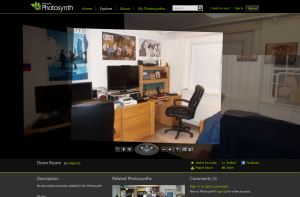
You have to grab that visitor, plant a big, wet, sloppy kiss on ‘em, and get them to start following you around like a sad little puppy dog. There are very practical, yet awesome ways of doing this. The issue is that it will take work. Imagine 360 degree panoramic views of a dorm room (or even better, perhaps a photosynth of one they can drill into). Put in to use something like a nice interactive map or virtual tour. It’s all about immersing the visitor in the experience of your university and leaving them with the craving to come back. First come back to your web site, and hopefully engage for an actual campus visit.
This holds true for any kind of experience that students hold in high regard. Think multimedia. The richer you can make the shared experience, the more the prospective student will want to become a part of it. This concept trickles down well to sports, student groups, and organizations too. But I’d leave that up to them to figure out, hehe.
Sin #6: Greed
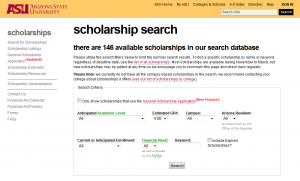
It’s all about the Benjamins. Well, sort of. You can make this as literal as you want to. If you do, then your mind likely goes right to financial aid. Want to appeal to your prospective student’s greed? Then make it easy for them to find and see how many scholarships they would qualify for. Ask yourself the question: “What will we give them to come here.” Then tell them that. Appeal to the prospective’s sense of ‘yay, free stuff!‘
You can also extend this to ways that can help the students get stuff (like money). Make it easy to see what kind of job opportunities are available, or mention chances to meet with university folks where they can also get swag, event tickets, bookstore discounts, etc. Free food and t-shirts can be a good draw for a lot of stuff.
Sin #7: Wrath
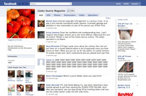
Wrath might be the hardest of the sins to understand in terms of a marketing tool. Think of it in a reactive context, rather than proactive. There have been a number of discussions in our community on topics such as how to handle negative comments on Facebook. What I’m getting at is that it isn’t your wrath you use, but your critics’. More often than anywhere, you’ll see this manifested in social media: Twitter, Facebook, professor rating sites.
When you have cultivated a strong community, more often than not they will come to your defense. This reflects well on you, because when the response comes from the organization, it’s just seen as towing the line. When the comment isn’t necessarily super-wrathy, you have an opportunity to show how you respond to issues, exemplify the fact that you are growing to meet demands and needs.
Most importantly, be open to feedback and criticism. People are going to get upset at the university from time to time, and how you respond to that will go a long way to build valuable social capital in your community.
Conclusion
Think of this as a fun way to inject some fresh life into your web marketing strategies. There are plenty of ways that you can use techniques like this for inspiration when you are planning out ways to promote your school, so don’t be afraid to think outside of the box once in a while. Jump down to the comments below before you leave or join us on Twitter to share some of your own #7sinmktg ideas.
Photo credit:
By Director of Web Marketing
GeneralMarketing