I had coffee with a colleague one day a few months back and she made a great analogy in regards to email. When you’re looking to buy a car, the dealership will give you all sorts of pretty brochures with lots of pictures and bullet points to convince you its the right car for you. They don’t give you the owners manual until AFTER you’ve made the purchase.
In higher education, we love to fill emails with as much information about humanly possible to users who haven’t yet decided to make the purchase. We’re giving them the owners manual before the brochure. Over the medium, it just doesn’t work. Instead, you need to grab your user’s attention as quickly as possible. Make the message so bold that they can’t help but look. Here are some steps you can take:
Differentiate your links from the text
When a user opens one of your messages, make sure they know what you want them to do. Which do you think works better:
blah blah blah blah blah blah blah blah blah blah blah blah blah blah blah blah blah blah blah blah blah blah blah blah blah blah blah blah blah blah blah blah blah blah blah blah blah blah blah blah blah blah blah blah blah blah blah blah blah blah blah blah blah blah
-or-
blah blah blah blah blah blah blah blah blah blah blah blah blah blah blah blah
blah blah blah blah blah blah blah blah
blah blah blah blah blah blah blah blah blah blah blah blah blah blah blah blah
Copy is irrelevant. Subject matter is irrelevant. This is nothing more than how you design the message. Pull the call to action out of the paragraph and let it stand on its own. Bold it. Slightly increase the font size. Play with the typography. Do what you can to make it the first thing your users see (while still making it look professional…it is coming from a college after all).
Subtlety is out
I’ve seen people spend enormous amounts of time segmenting a message, only to change one or two words that appear mid-paragraph in each segment. That’s crazy. People rarely read these things word-for-word and just aren’t likely to notice a one or two word difference, yet it would take hours to coordinate it. That’s a waste of time. If you’re going to dedicate the time to segmentation, do it in a way that will pay off. Make sure your users will notice that you’ve made the effort to target the message to them and things they care about.
Ditch the form letter format
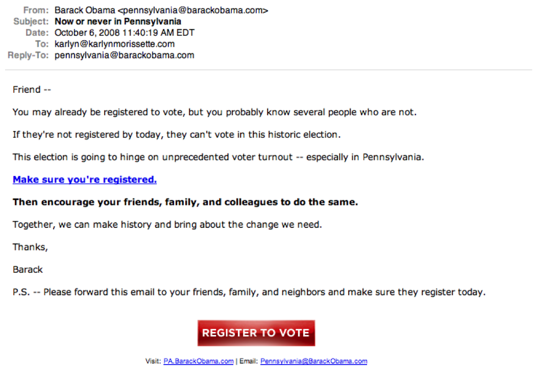
Higher ed has some pretty skilled print communicators in its ranks. These are usually the people who get put in charge of electronic communications. How different can it be, right? But nine times out of ten, it just doesn’t translate. Form letters that may work over print is one of the tactics I see most often directly translated to email. It’s not written for the medium. Big blocks of text only confuse the user and make their eyes glaze over, rather than inciting them to action. Instead of making a direct translation try something like this:

This email is still in a letter format, but affectively its also a bulleted list without the bullets. It’s much easier for your users to scan to find the call to action.
~~~~~~~~
Email is no place to be subtle or coy. Your best results will come when you’re as overt as possible with your users. Remember, the goal of an email is not to educate - it’s to get your user to click on a link, go to your website and take an action. Keep an eye on that goal and you’ll be more likely to design more effective messages.
If I receive a marketing email and there is a novel’s worth of text I go straight to see who it’s from and depending on who it is I might not even give it a once over.
I think the example from Obama is wonderful. Making short, concise paragraphs end up being more more effective.
Save the long winded conversation for a phone call or face to face meeting!
We did some test a while back and I believe that links that were bold got a 20% higher click through rate. Something that simple to help it stand out. Now imagine if you made bold all your links not just in email, but on your site and on other sites linking back to you. How would you like to increase engagement, traffic, etc 20%? I wish I had some more of the research, but yeah something that simple does make a HUGE difference.
truth - email should be no frills, just info with strong calls to action. save the prize-winning prose for print.
Your advice reminds me a great deal of Jenny Redish’s in “Letting Go of the Words” . One of my favorite books for web content
p.s. You have a very good template . Where did you find it?
Bournemouth is still one of the greatest places to be in the Uk if you are single and seeking someone special, small enough not to be lost in the crowd, but large enough to find romance!