So the first of our Ask a Guru questions that we wanted to feature comes from Director of Web MarketingRender at North Carolina Central University. Director of Web Marketingwrites in:
“Multiple Templates on a Higher Education Website. Is this a good or a bad thing.”
Great question Director of Web Marketingso we passed it around to everyone and here is the input from different perspectives.
The Technical Web Marketer Perspective - Founder
Personally I feel that your website should be consistent. This doesn’t mean that it always has to include the exact same template for every single page, but that the pages should be branded similarly. This means that they should be consistent in color, font, graphics, etc. Yes you can give your content creators a few different templates (a good idea), but they should be required to work within these. Nothing is worse than clicking on an internal link in a college website and getting taken to a website that looks COMPLETELY different.
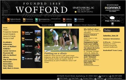
I’ll give you some picture examples. The following three came from the Wofford Website when I used to run the site. It looks like since that time the athletics site has gone in a completely different direction and lost some of that consistency. I’m sure that everyone in higher ed web knows this… athletics has a tendency to do their own thing so this isn’t totally a shock to anyone. I would even go so far as saying this consistency should be in place in all other online and offline marketing.

Wofford's Home Page
Wofford's Sights and Sounds Page
Wofford's Old Athletics Homepage
The Web Manager/Developer Perspective - Associate Director
My personal opinion is individual areas of your institutions web site serve different audiences, these audiences have different needs and different things resinate with them. Although it is important to uphold the identity of the institution it doesn’t mean you have to be absolute about it. A base set of colors, grid or wireframe is all you need to make many sites feel the same.
At my institution we have a standard header and footer that we require on all our sites. Beyond that we just have approved colors. We cannot enforce a certain template since all the sites don’t live in the same system. We do have a wireframe that all sites are built from but we don’t let it tie our hands if the needs of the site call some something different.
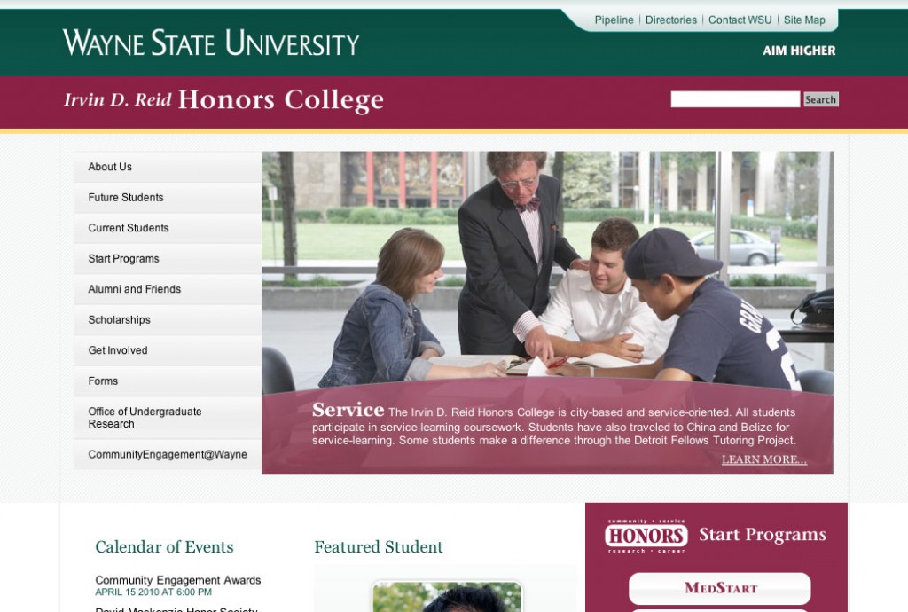
As you can see from the examples below, the first three use the same structure with navigation on the left while the admission’s site uses a different structure but still looks like it’s part of the same institution.
The Web Manager/Developer Perspective - Director of Web Marketing
I think that it is important to distinguish between the concept of a “theme” and a “template.” The reason for this is very important. In the question, asking if multiple templates should be used, you’ll find that there’s pretty much no way to not use multiple templates. A web site using only one template will be bland, boring, inflexible, and won’t serve your users the way they deserve. So, building on what Foundermentioned, I think the core of any institution should have a single theme covering all the basic design concepts, and this theme is then applied to a handful of templates. For instance, at our school we have six base templates people can choose from. They share common header, footer, and navigational elements, but each gives the content creator different options for the layout of content on the page itself. The amount of control your theme exerts on your overall web site will be partly dictated by your institutional breakdown.
All that said, I would also warn you to keep tools handy for one-off landing pages that might need to fit your theme, but be entirely independent of any templates you have. Such pages will be frequently used for advertising campaigns, microsites, and landing pages.
Do You Have A Burning Question?
Do you have a web related question that you would like the Guru team to answer? Ask the .eduGuru’s Your Question today!

Love this as I’m currently working on adopting a multi themed approach to the https://www.arkansasalumni.org site and micro sites.
First things first I’d like to expand on Michael’s thought about the differences between a “theme” and a “template” along with the three other main terms “Brand”, “Style” and “Logo” that get used throughout the HigherEd in the web design & development process.
First the Wikipedia links and some order:
Brand - https://en.wikipedia.org/wiki/Brand#Concepts
Logo - https://en.wikipedia.org/wiki/Logo
Style - https://en.wikipedia.org/wiki/Style_(visual_arts)
Theme - https://en.wikipedia.org/wiki/Theme_(arts)
Web Template - https://en.wikipedia.org/wiki/Web_template
So a quick warp up to get back on track.
Your “Brand” is determined by your customers/audience and is really just an overall concept of what you are for, about, and do by those interested in you. This then impacts the Logo (in this case we’ll take the Wordmark as part of that too) along with your Style which will thus create a “Theme” for your institution (you can control the Logo, Style & Theme - but if it doesn’t match the “Brand” then visitors will be confused).
So all said and done you’ve got your website identity without even getting to the “Templates”. You’ll notice that the Web Template is specifically designed to “seperate” the design from the content allowing any site to quickly adopt a new “Theme” quickly and easily. For the web people think of it like CSS vs HTML (the CSS is the “theme” and the HTML is the template).
Although not totally true you could consider a “template” more like the shell of “what can be included”. The template can control things like if and when to include a photo or a caption to that photo along with videos, links, etc.
So should you have multiple “templates”?
Unless you intened to make every page University wide include the exact same content elements (as you could guess that’s a bad idea) then I’d strongly suggest you have multiple templates.
What about multiple “themes”?
It is very true that not every page serves the same audience therefore I’d say multiple “themes” (created as I described above) are not only a good idea but highly encouraged. When done correctly “themes” will always complimnet each other and the visitors will know where they are and why.
Can I use paypal to pay for this?
Thanks for the excellent article. Is this a wordpress site? I like that platform, really good.
She is absolutely stunning! Wow, what else can you say?
These applications include study applications for students, social networking applications, and plenty of more. Students can use various types of iPhone applications which are helpful in studies, doing home-work, preparing for exams, online tutorials, iPhone dictionary and plenty of more.
Its really nice, lots of useful information. I never comment on those blogs, even when the content is great
An execllent write-up with strong points, We’ve been a lurker right here for a short time but desire to be a lot more included from now on.
Thanks for the nice post. I always like to bookmark concrete or construction related posts like this one.
Hi. I just noticed that your site looks like it has a few code problems at the very top of your website’s page. I’m not sure if everybody is getting this same error when browsing your site? I am employing a totally different browser than most people, referred to as Opera, so that is what might be causing it? I just wanted to make sure you know. Thanks for posting some great postings and I’ll try to return back with a completely different browser to check things out! Also, I put a link to your blog at my site,hope you dont mind?
Nice site I use a company called Ncube Digital for all of my Web Development and I would recommend them to anybody looking for a really good web development company. I can honestly say that I have never dealt with a company in the industry so ready to answer a phone or an email and give great help.
I never thought I would comment on a post, but this one was so right up my alley, I just could not let it pass me by. You have hit the nail on the head with this post…..this is definitely a keeper!
Ok,thank you,I’m going to try this too.
Hey there, I searched for this blog on Yahoo and just wanted to say thanks for the excellent read. I would have to agree with it, thank you again!
lots to think about.
This has definitely sparked up an idea in my mind. This really is a wonderful weblog publish.
I am inclined to agree that it is better to have multiple templates to give room to creativity than to squelch it with uniformity.
I finally decided to drop a comment, and let me tell you this is another very strong and powerful post. I’ve been reading through some of your previous posts and have been visiting your blog every now and then. I signed up for your newsletter and shared your site with my contacts, so please keep up the informative posts and return the favor.
Good luck on your blog, and feel free to comment and subscribe to my blog as well when you get a chance: Make Money Online with Dino Vedo.
Thanks so much, and lets stay connected and maybe share some ideas, do some guest posts, and get us both some more traffic and backlinks!
All the best,
Dino Vedo
I think its better to use the theme for the page with its content, many a times I have seen designers making very good designs for the website but doesn’t go well for all the pages in the website. I personally feel that website designing should be modified with the content of the website as you have shown clearly in the above examples…
thanks for your excellent post. i like posts like this!
Consistency is very important and unfortunately sometimes under-appreciated. My university’s site was extremely inconsistent. There were branding and design guidelines in place, but the departments were responsible designing their websites so they were all very different.
When a plan isn’t set in place at the beginning, it is hard and time consuming to reel everyone in and redesign all sites to bring them into compliance.
Is it confusing to site visitors if the exact same content is found in multiple places on a website? For example if I am building a website for a doctor practice and I have information about a procedure under two sections of the website (exact same copy) is this good or bad? I don’t want to confuse visitors.