I’m sure most of you saw the University Website xkcd comic last week and shook your fists in the air. The front page of a university website is a battleground, no doubt. Dylan Wilbanks posted a good reaction to the comic on his blog and Steve Kolowich covered it extensively in Inside Higher Ed.
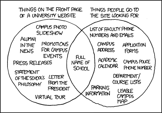
If you haven’t seen it, take a look:

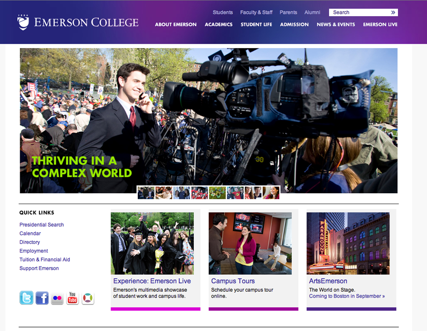
I immediately used the Venn diagram like a bingo sheet on the Emerson College front page, checking off many more items from the “things on the front page of a university website” side. Then I saw this tweet from a current student:
Photo: Hey @emersoncollege, this is absolutely 100% true! (via XKCD) https://tumblr.com/xuuexvkwi
XCKD comic confirmed. This got me thinking. What if I redesigned Emerson College’s front page to mirror xkcd’s Venn diagram? Well, here goes.
Before:
After:
I’m not sure if this will fly with the higher-ups at Emerson, but hell, it’s worth a shot. Thanks for the inspiration, Craig.
 John Keane

This cracked me up. But in all honesty, props to Web Managerwhose Emerson page is one of the cleanest higher ed pages I have seen. It’s not too far off from the XKCD ideal to begin with.
That’s a bit of a straw man, don’t you think?
I think you’re sacrificing the opportunity to think constructively about this for the sake of a cheap joke.
The real issue here is that, as Steve said on InsideHigherEd, university websites are typically designed / organized by fiat from up on high rather than based on reality. When I meet with clients around campus, there is always this unspoken assumption that if something looks cool and is done by someone else, CLEARLY it must work. (the campus library website was by far the most egregious instance of this groupthink)
There is so much wanting for proper usability research in higher ed websites. We’re all so caught up in this arms race of being the flashiest website that we’re completely forgetting who our REAL audience is: not EduStyle or our higher-Ed peers, but the students themselves.
Among Craigslist and Emerson’s website (nice work, btw) are a whole gamut of possibilties, many of which have yet to be explored. Rather than take it personally and build up a straw man to tear down, why not focus on the positive message? Make a mockup of your site using the EXISTING design that features the elements of Munroe’s diagram appropriately?
The real issue here, I think, is that as higher ed marketing folks, we must begin to consider whether we can continue to treat our audience as homogeneous when in fact they are quite heterogeneous w/r/t their content wants/needs.
Thanks for your feedback Aaron, I do appreciate it. Believe me - Emerson went through an entire site-redesign for over a year, and many of these concerns were brought up through that process. Even though (I think) our team got a lot of things right, the xkcd comic still hit home.
The nature of my post here was solely for the sake of humor, and to let us higher ed web developers and markets to understand that there’s others out there like us (that’s why we attend conferences, right?)
There were excellent points brought up by Dylan and Steve in their blog posts, so I thought I’d take a different approach for some humor on a Friday. The Craigslist redesign took only a couple hours over the past week, but approaching the xkcd Venn diagram with a more realistic application - THAT’s something I’d like to see (as long as someone else does it.. haha).
I understand.
Maybe I should take a crack at it with IU East’s website…
Just what I needed on a Friday
I love the venn diagram. I’m afraid to try matching it to my campus’s urrent website design. Oy vey.
Not to be a downer, but does anyone else find it a bit ridiculous that the entire higher ed web world is treating this cartoon as if it was some great revelation, when we all knew it the whole time? It’s CARTOON PEOPLE. One with information that was not new at all.
And Mike’s post is hilarious
It’s not so much that it’s a great revelation — yes, we all knew it — but it was a bit of an invisible gorilla in the room; no one wants to talk about it or even consider it.
I’m a web developer in higher ed, and I have opinions (that happen to be in line with Munroe’s, actually). My opinions get superseded by my superiors though, and while I may occasionally speak my mind about certain issues in an advisory role — ultimately they get the final say.
If it should be a revelation to *anyone*, it would be the administrators that call the shots about web content. I mean, seriously — letter from the president?
More importantly though — Munroe is absolutely correct. If this really isn’t a great revelation then why the hell haven’t we done anything about it? How can we use this opportunity as a catalyst for positive change?
No one wanted to talk about it? I think a more accurate description is that people talked about it for so long without being able to effect change that they got frustrated and stopped. I’ve heard people talking about this for YEARS…on this site, on other sites, in meetings, on Twitter, at conferences…at some point, you just give up.
By “no one wanted to talk about it” I was referring to the lack of dialogue between university officials that mandate the inclusion of low-usable content and the people that actually maintain said content.
The fact that they were unable to effect any change in the past is why I’m suggesting we try and capitalize on this opportunity; strike while the iron is hot, as it were.
There is a massive discussion happening about this on the Internet right now — and upper-level university officials are, for the most part, marginally more internet-savvy; how about we all shed our jaded coils and try to reach critical mass, rather than making fun of it being pessimistic?
No, it’s nothing new. Yes, it’s everything we talked about for years. But it’s amazing what changing the presentation of data will do for concept recognition.
We’ve talked about it all along. It’s just been in the last few years, though, that any possible alternatives have appeared, e.g. content strategy, user-centered web design, etc. So the conversation is still valid, I think.
Thing is, I heard from a LOT of people outside of academia saying this was their employer’s/client’s site too. There’s a lot of truth in that image.
Luckily for me Aaron, I don’t work at a school anymore so it’s really no longer my problem LOL. But I’ll say this - nonsense like this is EXACTLY why I defected. If it takes a cartoon for my boss to listen to what I’ve been saying for years….how can that not be a professional insult?
Yes, take advantage of the situation to make change…but you can’t fault people for approaching the “great revelation” with cynicism at best.
Head of Marketing : the cynicism is understandable — this is definitely a “facepalm” moment.
I think the crux of this problem is that people are still applying print-media practices to web formats. I regularly have to pare down content that is *FAR* too long (by pages upon pages). Many people, particularly in academia where lengthy reading comes with the territory, just aren’t used to exercising extreme brevity, or optimizing their copy for scannability.
I think this addressing this issue has the potential to be the next big thing in higher ed websites, like how social media integration was a couple years ago. We’ll have to see!
And also, we’re starting to get the message through to some of the decision makers that the web isn’t about them, it’s about the people who use the siteincluding them.
The complaint about it not being anything new is sad because it hasn’t been “new” for years. It’s still the same damn problem. But there are now solutions, if we want to take them.
The blog is amzaing, I like the way you instruct the different way of things. Thank you so much for sharing the information wih us.