One by one, colleges and universities are taking the next step in web development and moving towards addressing mobile needs. The mobile based web has already begun its move to create another technological generation. In this way, the Internet (as a proper noun), has truly become a force of nature. Its ubiquitous nature is an evolutionary trait, grown out of a fight for dominance. We can no more stop its move to our handheld devices any more than we can stop a landslide. We cannot complain about the workload. We cannot whine about resources. We have to address it, and we have to nurture it, or we will eventually become a victim of it.
Today, it is completely unimaginable that a university would exist without a website. Bad, good, awesome, terrible - it doesn’t matter, you have one. It is expected, demanded, and if you didn’t, it would have a devastating impact on the impression people have of your school. We are little more than a stone’s throw away from this same trend for mobile web. Over the next two years, expect this demand to grow exponentially (and I’m not speaking hyperbolically). Start researching now. Learn what others are already doing, and begin to craft a strategy so that you will be ready to make the move.
First, here are some suggestions when you start thinking about what you should do to design your mobile web site:
- Having a mobile site isn’t just about making your current site look pretty on mobile phones. Usability is different. Accessibility is different. Trends are different. The same as with your current site, starting a mobile site means researching your audience(s), and building the tools to meet their needs.
- Mobile web is about more than the iPhone. Yeah, there are a lot of them out there, but don’t forget about Blackberries, Android based phones, Palms (though their future is uncertain), and Windows Mobile, to name a few. WebKit is cool and renders pretty well, but it isn’t as ubiquitous as you might think.
- Sites are better than apps. A well designed mobile web site will serve you better and be easier to maintain than trying to keep up with several different mobile applications (even if the apps themselves are really cool). If you have the resources, then go for it, but only if you feel you have done everything with a mobile web site that you can. Besides, if you can’t do a mobile website well, what makes you think you can handle one or more mobile applications?
- Set goals. Once you know your audience and needs, decide what you’ll provide them and how to determine if it was a success. Once you’ve done that, begin looking at the problems introduced by a mobile platform, and then set new goals to fix them. Goal #1: Never stop setting goals.
- Don’t be afraid to compromise. Like I said, whining about our resources won’t change the fact that we’ll have to address this need, but we can acknowledge that we might not be able to do it perfectly. Do what you can, plan phases into your feature roll out, and admit (to yourself, your peers, your bosses, and your audiences) that good work can take time. This might sound in conflict with #2, but we still have an obligation to balance the ideal with reality.
- Don’t reinvent the wheel. It’s hard to be revolutionary, and if you are, you risk alienating audiences with predefined expectations. Your mobile site might end up looking like someone else’s, and that’s okay. Make your tools good, usable, and valuable. People will forgive you even if you aren’t setting a new standard. I’m not telling you to not try new things, just don’t try to redefine the standard.
- Measure and adjust. Let me say that again: MEASURE AND ADJUST. This might surprise you, but this concept applies to stuff beyond mobile web development. Being successful at what you do means you need to measure goals, and make adjustments accordingly. Even the most successful efforts will turn stale over time. The web is like a living thing (I’ve been really going with these comparisons lately, huh?), you must maintain it. Feed it, groom it, and take care of it. If you stop measuring and adjusting, you are not doing your job.
So, now the fun part. I want to showcase a handful of sites for you that are out there that you might be able to get some ideas and take some cues from. This is obviously not an exhaustive list. It’s not a perfect list. It’s in no particular order. And I also have to admit I only went through these on my iPhone, as I unfortunately lacked anything else as I worked up this post. But, of the several dozen sites I went through, these all had a little something extra to bring to the table.
1: Virginia Tech - https://mobile.vt.edu/
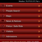 Virgina Tech’s mobile site is a great example of a site with a nice smattering of a little bit of everything. The layout is simple, and the theme is fairly eye-pleasing and easy to read. While their mobile map implementation is simple, it is a nice touch and can be useful for visitors who come to campus. On that note, they dedicate a page to visitors, though I think that would benefit from a parking location map under the parking info section.
2: MIT (https://mobi.mit.edu/about/) - https://m.mit.edu
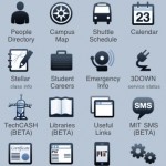 I’m not really sure how you can expect MIT to not make this list. For one, they have probably one of the most technically heavy mobile sites available currently. Two, they’ve actually released their framework for anyone to use, and that’s just super nice of them. Sure, it’s not going to win any design awards, but they have crammed a ton of tools into a limited space, and made them flexible and useful. They have also kept their audience in mind, not wasting space on tools that simply wouldn’t be useful to the average, geeky student there.
3: Adelphi University (https://m.adelphi.edu/info.php) - https://m.adelphi.edu/
 I share Adelphi as an example of a simple, but appealing mobile site design. They’ve named their page (AU2Go), and followed the Apple tradition of icon based “app” links. The “Today at Adelphi” is a great idea for a tool, giving users a quick snapshot of things taking place that day. Ideally, this would be more than just an event list, and could include more engagement, specific calls to action, and multimedia to reinforce those activities. The campus directory is a nice touch, even if it lacks people search. I also found it interesting that they specifically broke out the art exhibitions and have to wonder if that’s a result of specific community targeting, or just a “let’s do it because we can” feature.
4: West Virginia University (https://m.wvu.edu/about/) - https://m.wvu.edu/
 Like Adelphi, West Virginia also sticks to the button theme. But, I find WVU to have successfully created a mobile page that I just find exceptionally pleasing to look at. The colors are nice, the icons are sharp, and the color theme is easy on the eyes. They’ve gone the extra distance to actually pull their YouTube feed right into their page, a nice touch, as well as provide a directory search within the mobile framework. The map, though a little slow, is very well implemented. Lastly, check out their athletics section. If I had to pick a favorite, WVU might just be it, as they’ve done a whole lot right and very well.
5: Roanoke College (https://www.rcnewsblog.com/?p=933) - https://i.roanoke.edu or https://m.roanoke.edu/
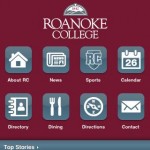 Roanoke took a simple approach to their button tools. That’s okay. What really makes them stand out is the fact that they have used their mobile home page as more than just a bunch of button links, and have gone so far as bringing in news and multimedia to share the space as well. You have to scroll the page to see it all, which can get missed since the page doesn’t provide any indication of more content “below the fold” of the mobile viewport. I like that they thought outside the box on that though, and it doesn’t feel awkward at all when using it. They are also one of the only sites I saw that included a dining menu too, something that even as staff I would find useful, as I like eating on campus once in a while. Lastly, they took the time to do two versions of the site, one specific for iPhones, and one more generic (both links above).
6: Oxford University - https://m.ox.ac.uk/
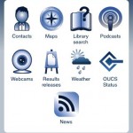 Across the pond at Oxford they’ve also gotten in the game. What made them stand out to me was that they have built in their iTunesU section for mobile devices, and have also made campus webcams available for viewing. While I’m not sure how useful the webcams would be, it is certainly darn cool. Looking at their mobile domain name also makes me giggle a little, for no good reason. The map, in my opinion, needs work. It has really been built with campus people in mind, and as someone who’s never been to England in the first place, I couldn’t even use it. So, nothing super great here, but a couple unique touches that are nice to see.
7: Ohio State University - https://m.osu.edu/
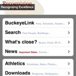 Last but not least is Ohio State University, which is right there with WVU for sites that I have stolen ideas from really like. Right off the bat, on the iPhone you’ll notice they’re making use of the GPS (I assume for things like the directions page). The page itself is well designed, and is easy to look at and make sense of. They broke away from the more common button/icon based navigation, which I thought was nice to see. The search tool is top notch. They were also one of the only mobile sites I saw that included a section for mobile media, like ringtones and wallpapers. I would be curious to see if they are tracking stats on that tool’s usage. All in all another very well planned, designed, and executed mobile site that their users should be proud to have.
Tools
The mobile world is still a little wild and untamed at the moment, and it is important to make sure you have the necessary tools to make sure you mobile site behaves as expected. Here’s a handful of resources to get you started, in hopes that they can make your tasks easier. Use them to populate your toolbox with to prepare you as you look into building or enhancing your mobile presence.
Simulators/Emulators
- Opera Mobile Simulator
- Blackberry Device Simulator
- iPhone Test Center/Emulator
- More reading on mobile device emulators
Scripts
- jQTouch - A jQuery plugin for mobile web development on the iPhone, iPod Touch, and other forward-thinking (preferably WebKit based) mobile browsers. Documentation isn’t great, but the tool is pretty awesome. Look back soon for an article outlining our experiences using jQTouch to develop Pittsburg State University’s mobile site.
- MIT Mobile Web - A project designed to allow developers to collaborate on developing Mobile Web Sites primarily for higher education institutions to provide mobile access to information to students, faculty, staff, and visitors.
- Detect Mobile Browsers - A PHP script to detect and handle users showing mobile user agents.
- WURFL Project - Not a script, per se, but a configuration file crammed with mobile capabilities. They feature also feature Java and PHP APIs.
Sites/articles
- AdMob - A mobile analytics system.
- Google Mobile Blog - This is linking specifically to their post talking about the introduction of mobile based tracking built in to Google Analytics.
- Mobile Analytics Revisited - This is one of my past posts looking at ways to track and use mobile analytics with Google.
- Mobile Web Design Trends for- Even though it’s a year old, this article from Smashing Magazine still has a ton of good and relevant information in it.
- Jakob Nielsen on Mobile Usability - Always thorough and extremely useful, Jakob looks at a number of issues facing mobile site usability.
- CSS eye-candy in mobile browsers, a comparison - a simple table view of some advanced CSS3 features and how they compare across multiple mobile browsers.
Hopefully you can walk away from this with some ideas and ammunition for your mobile project. If you have any additional resources that you’ve found particularly useful that aren’t mentioned here, be sure to share them in the comments. We have recently completed the first step of designing our mobile web site using jQTouch, and will be launching it shortly (thanks to those of you that assisted me by lending me your eyes and phones for testing). Just after the formal launch, I’ll be outlining and discussing the process we took, and how we’ll be handling the site moving forward, so keep your eyes open for that post coming up soon to answer additional questions you may still have.
Michael,
Thanks for including our mobile site. We’re pretty pleased with it. Unfortunately, our Windows Mobile/Blackberry site is down right now. Nice article.
This is a great article on mobile and mobile resources for higher ed folks. The “what’s close to you” feature of OSU’s site is really intriguing and it’s not terribly difficult to implement. I really need to get our mobile site into MySQL instead of SQLite to take advantage of serious math on the database side.
To add some resources, the code behind West Virginia University’s mobile site is also open sourced. Documentation and a link to the code can be found at https://mobiweb.pbworks.com/. Our code is built on top of v0.9 of MIT’s code so it has similar capabilities. Version 2 just dropped and I’m still trying to get to the documentation for theming.
I also have a presentation regarding mobile on SlideShare, https://bit.ly/1CEvyM, which has some numbers from last fall regarding usage of our site. I’m happy to share updated numbers if anyone is interested.
There are two points I would add to your article. The first would be a point #8, “It’s all about context.” From what we’ve seen everything has to make sense in the context of mobile. Tasks like calendar, map (especially at the beginning of a semester), and directory absolutely kill things like news, links or, in our case, YouTube. The first three are things that someone wants/needs to refer to while they’re out and about. That kind of content is what’s going to drive your mobile site.
The second would be a point #9 which would be “Advertise, advertise, advertise.” I’m not sure the normal population on a campus expects a university to have mobile site so you have to do some education. Redirecting mobile traffic from your home page, calendar, directory, campus map, WiFi login etc. to this site is also a must to help folks understand the resource is available. The biggest downside to mobile web vs device specific apps is ease of discoverability/re-discoverability. I’m curious, as we use them more, if QR codes will help any with discoverability.
It’s great that you took the time to write up this article. This really is the next frontier for higher ed from a web development perspective. And, hell, if you’re a techie doing mobile gives you a great excuse to play with HTML5 and CSS3.
Here at UNC Chapel Hill we built our site off of MIT’s code. It’s at https://m.unc.edu
Key for us is being able to detect phones on the fly (via WURFL) since our traffic breaks out at about 80% iPhone/iPod touch and 20% other (mostly blackberry). We have taken a web based approach to app development largely because it gives us the flexibility to work on numerous platforms and doesn’t tie us into re-writing native apps or multiple devices.
Good article. I work for a company that develops a CMS, SiteExecutive, sold to mostly higher ed and healthcare industry. Last year we knew mobile web was going to be a need for the higher ed space. We added a new feature to our product that performs mobile device detection and will serve the user a different template. This way you can create a mobile site linking to the appropriate content but serve it in a mobile friendly display.
Какие нужные слова… супер, отличная идея
Happy to report that both of our mobile sites are working great now. Thanks again for including us.
Added a link to the article to a good blog post looking at cross-mobile-browser advanced CSS compatibility.
Me too! Thanks
A very comprehensive list of best practices along with some great examples. Another one that you should take a look at it is the iPhone application for the University of Saskatchewan in Canada. They were one of the first Canadian Universities to develop a mobile programming course which eventually spawned the uSask iPhone app and is considered leading edge by Apple Education.
https://www.collegemobile.com/videoCenter.php